The biggest thing that Tempest insisted I aim to capture in my work was the eclectic nature they try to embody in every element of their brand, from ingredients and flavours to branding and visuals.
The issue that stood out the most to me with Tempest's existing branding was its lack of consistency; for that reason, one of my core focuses became ensuring my branding solution felt unified and cohesive.
Tempest's can labels tell a story about the beer, whether it's the journey that inspired its creation, or an illustration of the flavour experience. It was crucial that I maintain that ability to tell a story in my branding solution
Designing a branding suite for a real client means meeting not only the brief’s requirements but also adapting continuously to feedback and changing minds to ensure the final outcome is truly fit for purpose.
Following my initial dissection of the existing branding, I sat down with the Marketing Director, Neil, to present my findings and discuss what they were looking for as a brand. My hope was to pick out some keywords and ideas that I could use to start my ideation and development before getting in touch again to refine the branding direction.
With the words and terms Eclectic, Outdoorsy, Memorable, Hint of Darkness, Authentic, and Pioneering, I got to work developing some conceptual ‘worlds’ in which a branding solution could be created within.
The 3 Directions I started with for my exploration were:
The first was a community-based concept that would bring Tempest.
customers into the process of branding cans, experimenting with more abstract logo structures, and developing a language of icons to communicate information about beerswithout the need for type.
Next was a concept that played with the aesthetics associated with violent storms and weather events, as “tempest” literally means “a violent windstorm”. This concept uses the signal disruption that may occur during extreme storms as visual assets and texture within logo forms. This direction not only fits with the core narrative around tempest, but also works with their “bold” and “innovative” approach to brewing.
The third concept was more of a ‘story’ approach, where the labels of the cans would be made up of an illustration of the place that the flavour of the beer would transport the consumer to. The other perspective of this was the illustrations of the process of brewing the beer in the can.
While the 3 ‘worlds’ I started to develop each had its own merits, ultimately I decided that it made more sense to stick with the core aesthetic of Tempest’s labels. They still needed some work, especially in their applications; the art style and ‘feel’ of the labels are arguably the most defining features, so my plan was to capitalise on that and develop a more polished branding solution around that.
Off the back of my talks with Neil and the picking out of some keywords, phrases and design elements, I got to work experimenting with icon forms and how I might be able to use different shapes to convey elements of the Tempest brand or story. The lightning bolt in the existing branding was a core element to the appearance of the brand, so I took influence from that while developing my own takes on the form.
Some other considerations made while working on the icon/visual side of the brand were the scalability of the logo, meaning that it could be applied in all the places they could want, in a way that did the logo justice. One of the ways I accommodated for this was focusing on a 3 mark suite (Typemark, Combination Mark, Icon), which would mean seamless application from profile pictures and favicons, to large format prints and posters.
With this project being one of my first solely brand/graphic-oriented projects, I was developing and altering my workflow the whole time. One thing I started early on and stuck with for the duration, though, was rattling out loads of hand-drawn variations of a design and scanning those pages of sketches into Illustrator to further tweak and fettle with. I’m sure everyone has their own process, but this seems to be the quickest and most effective way for me.
The visual elements like logos and imagery do the brunt of the heavy lifting when it comes to telling a brand’s story, but they don’t do it all. To keep in line with the definition of “Tempest” and the brand’s ethos, I employed several other ways of channelling their brand into the full brand suite.
Colour has a massive impact on the ‘feel’ of a brand, and for that reason, I spent a great deal of time experimenting, testing and trialling different combinations to build a clearer image of the best solution for this brand. For the most part, the existing colour palette used in the Tempest’s branding served its purpose, primarily monochrome with a few splashes of colour for accents and details. There were just some areas where they strayed from these colours, causing some of that inconsistency I was talking about. This meant that the final selection didn’t need to be changed too much, but I have refined it to some slightly better-suited tones, alongside developing some rules for application to help minimise the inconsistencies that they suffered from previously.
Typeface is another angle that needs to be addressed when considering a branding suite. Keeping in line with the existing ‘feel’ of Tempest’s branding and the aesthetic changes that came with my suite development, I opted for a playful, blocky sans-serif type. The heavier weights of the typeface work nicely to communicate beer names and information in a clear, punchy manner, and thinning it down keeps it legible without feeling too serious or faceless.
I’ve been touching on “storytelling” throughout my spiel about this project, so now that we’ve gotten to the final stages, I suppose it’s probably time to highlight some of the elements in my branding suite that tell Tempest’s story.
Probably the most noticeable element is the “M” or mountain icon. You’ll notice it has 3 peaks, these signify the 3 peaks of the Eildon hills that overlook their brewery in Tweedbank, Scotland. In reality, they’re nowhere near as dramatic, but Neil mentioned that it would be a nice detail to include and having 3 rolling bumps wouldn’t exactly make for very strong imagery.
If you look closer, you’ll also notice that the lines of the type in the wordmark don’t have a clean edge. This is in part to distort the ‘feel’ of the logo like a storm might distort a TV, but primarily it’s a nod to the eclectic, outdoorsy notes of the brand. Softening the edges also creates a more hand-drawn feeling, which, if you’ll indulge me, links to the pioneering aspect of the brand, creating a subtle feeling of imminent change or iteration.
While the typeface itself is an important choice to make, how you apply it can have a bigger impact on the overall presentation of a brand. To address that, as well as the inconsistency that plagued Tempest’s existing visual presence, I created a set of rules for how to apply typeface in various areas and formats. These guides include font weight, case, sizing recommendations, leading, as well as scaling formulas for sizing up and down the different types proportionally.
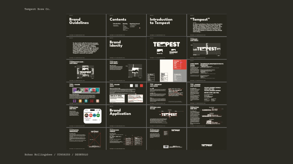
The biggest thing for me when I was starting this project was addressing the inconsistency in the way the Tempest presented itself. Initially, I also wanted to totally change the face of the brand, but soon realised that the core of the brand’s identity is already strong and just needed some tweaking and more careful application to really polish it. So moving on from that and focusing on the bigger issue, I centred my project around the development of a tool that would ensure that Tempest would have a set of rules to stick to when applying any element of the branding suite and thus, create one unified and much more recognisable brand.
These guidelines encompass elements as simple as logo size, spacing, and application rules, font sizes, and specific colour hexes, to label illustration boundaries and layout aids and assets for populating labels with the required information. All in an effort to pull all the visuals of the brand together and do justice to the already strong aesthetic they’ve created for themselves.